
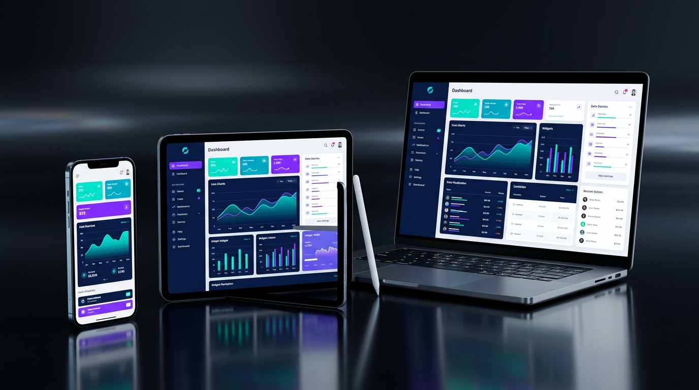
The Cardinal Anti-Pattern: Screen Multiplier Scaling
Many developers attempt to make their applications responsive by creating global scaling utility functions that multiply every padding, font size, and container width by a screen ratio factor. This is a severe anti-pattern that betrays the fundamental expectations of tablet and desktop users.
A tablet user does not want to see gigantic buttons and massive 48pt body text. They have a larger screen because they want higher information density: multi-column dashboard layouts, master-detail side-by-side lists, persistent navigation drawers, and split-screen multitasking. Responsive engineering is about transforming the layout structure and hierarchy, not inflating pixels proportionally.
When designing for cross-platform devices, categorize viewports into three standardized breakpoints in accordance with Material 3 responsive specifications: Compact (width < 600dp, typically mobile phones in portrait), Medium (width between 600dp and 840dp, including foldables and small tablets), and Expanded (width > 840dp, covering large tablets, desktops, and web displays). Each breakpoint demands an intentional layout topology.
The Power of LayoutBuilder Over Global MediaQuery
A common beginner mistake is querying MediaQuery.of(context).size inside reusable UI components. MediaQuery returns the dimensions of the entire physical window. But in modern applications, widgets frequently exist inside split views, modal bottom sheets, floating dialogs, or collapsible drawers.
Your widget does not care about the size of the glass on the phone; it cares about the constraints handed to it by its direct parent. LayoutBuilder evaluates local BoxConstraints, enabling you to construct components that adapt dynamically whether they occupy the full screen or live inside a compact column or sidebar.
class AdaptiveProductGrid extends StatelessWidget {
  final List<Product> products;
  const AdaptiveProductGrid({super.key, required this.products});

  @override
  Widget build(BuildContext context) {
    return LayoutBuilder(
      builder: (context, constraints) {
        // Compute column count based on available parent width constraints
        final int crossAxisCount = constraints.maxWidth > 1100
            ? 4
            : constraints.maxWidth > 750
                ? 3
                : constraints.maxWidth > 480
                    ? 2
                    : 1;

        return GridView.builder(
          gridDelegate: SliverGridDelegateWithFixedCrossAxisCount(
            crossAxisCount: crossAxisCount,
            childAspectRatio: 0.8,
            crossAxisSpacing: 16,
            mainAxisSpacing: 16,
          ),
          itemCount: products.length,
          itemBuilder: (context, index) => ProductCard(product: products[index]),
        );
      },
    );
  }
}
Mastering Foldables and Dual-Screen Display Features
With the rapid adoption of foldable hardware like the Samsung Galaxy Z Fold, Google Pixel Fold, and OnePlus Open, mobile developers must account for physical hardware hinges and posture states. Placing a primary call-to-action button or text input right over a physical screen fold creates an embarrassing user experience.
Flutter provides first-class support for foldable hardware via MediaQuery.displayFeatures. By inspecting DisplayFeature objects, your app can detect whether the device is flat, half-opened in tabletop/laptop posture, or folded closed.
Wrapping your layouts in DisplayFeatureSubScreen automatically partitions UI content onto the left and right halves of an unfolded screen, treating each display area as an independent viewport while ensuring dialogs and bottom sheets never span across the physical hinge.
Widget build(BuildContext context) {
  final displayFeatures = MediaQuery.of(context).displayFeatures;
  final isFoldedHinge = displayFeatures.any(
    (e) => e.type == DisplayFeatureType.hinge || e.state == DisplayFeatureState.postureHalfOpened,
  );

  if (isFoldedHinge) {
    return DisplayFeatureSubScreen(
      anchorPoint: Offset.zero,
      child: TwoPane(
        pane1: LeftNavigationPane(),
        pane2: RightDetailContentPane(),
      ),
    );
  }

  return StandardSinglePaneLayout();
}
Platform Adaptivity: Speaking the Native Dialect
Responsiveness is not just about spatial dimensions; it is also about platform dialect and interaction paradigms. iOS users expect smooth swipe-to-back gestures, modal sheets with grabber handles, Cupertino-style blur navbars, and rubber-band overscroll physics. Android users expect Material 3 dynamic color theming, floating action buttons, predictive back navigation, and glowing overscroll indicators.
Desktop and web platforms demand hover states, mouse pointer cursors, keyboard navigation shortcuts, and right-click context menus. When deploying Flutter to the web or desktop, wrap interactive cards and buttons with MouseRegion and FocusableActionDetector to ensure mouse hover effects feel completely natural.
- Use CupertinoPageScaffold and CupertinoNavigationBar when running on iOS, and Scaffold with NavigationBar on Android.
- Wrap clickable desktop elements in MouseRegion(cursor: SystemMouseCursors.click) for desktop parity.
- Implement Shortcuts and Actions to bind common keyboard commands (Enter, Esc, Cmd/Ctrl+K search modals).
- Leverage clamp() on font sizing and padding: fontSize: (screenWidth * 0.04).clamp(14.0, 20.0).
Final Thoughts
Creating responsive, adaptive Flutter applications requires thinking in flexboxes, constraint boundaries, and fluid layouts. When you respect the form factor of every device, your app feels genuinely handcrafted for every user.
Key Takeaways
- Never blindly multiply font and padding sizes by screen ratios.
- Use LayoutBuilder constraints to create truly self-contained adaptive widgets.
- Embrace Material 3 responsive breakpoints (Compact, Medium, Expanded).
- Respect hardware hinges and display cutouts using MediaQuery display features.
- Integrate mouse hover regions, keyboard shortcuts, and native platform navigation dialects.
Frequently Asked Questions
What is the difference between LayoutBuilder and MediaQuery?
MediaQuery provides dimensions of the whole physical device screen (or window), whereas LayoutBuilder provides the BoxConstraints of the immediate parent widget. LayoutBuilder is preferred for reusable widgets that may render inside sidebars, dialogs, or split views where screen width does not equal available widget width.
How do I prevent Flutter text from overflowing on small mobile screens?
Never hardcode static widget widths. Combine Flexible or Expanded inside Flex widgets (Row/Column), set overflow: TextOverflow.ellipsis with maxLines, or utilize FittedBox with BoxFit.scaleDown for badges and prices that must never wrap.
Should I build separate codebases for Mobile and Web/Desktop?
No. A single Flutter codebase can effortlessly handle Mobile, Tablet, Desktop, and Web by sharing 95% of business logic, state management, and data repositories, and selectively conditionally rendering responsive presentation scaffolds based on breakpoint widths.